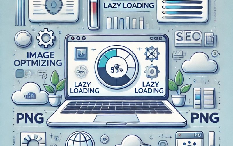
Images are one of the most crucial components of a website’s visual appeal, yet they are often the leading cause of slow load times. Large, unoptimized images can significantly increase the size of a webpage, resulting in longer loading times and negatively impacting the user experience and SEO performance. Optimizing images is essential to balancing visual quality with website speed.
Below, we explore several techniques to optimize images without sacrificing quality, ensuring faster load times and a more efficient website.
1. Compress Images for Size Reduction
One of the first and most effective ways to optimize images is by compressing them. Image compression reduces file size without significantly affecting the quality, ensuring that the images load faster while maintaining their visual appeal.
Why Compression Matters
Large image files take more time to download, slowing down your website. Compressing images reduces the amount of data that needs to be transferred from the server to the user’s browser, which leads to faster page load times. Since speed is a critical SEO factor, compressing your images can directly impact your rankings in search engines. To effectively optimize images, reducing their size while preserving quality is essential for balancing performance and aesthetics.
Tools for Compression
There are several tools available that can automatically compress images while retaining as much quality as possible. Tools such as TinyPNG, ImageOptim, ShortPixel, and Kraken.io are popular choices that offer both free and paid versions. These tools can optimize images by removing unnecessary metadata and colors, reducing file size while maintaining clarity.
- TinyPNG: TinyPNG is a simple tool that compresses PNG and JPEG files by reducing the number of colors. This results in smaller file sizes without noticeable loss in image quality, making it a go-to option to optimize images efficiently.
- ImageOptim: ImageOptim is a tool for Mac users that strips away unnecessary image metadata and reduces file size for a range of image formats.
- ShortPixel: ShortPixel offers both lossy and lossless compression options and integrates directly into WordPress, making it a convenient choice for many website owners aiming to optimize images directly on their sites.
By using these tools, you can dramatically reduce the size of your image files, leading to quicker load times and better SEO performance. Ensuring that you optimize images not only enhances the user experience but also boosts your website’s overall efficiency.
2. Choose the Right Image Format

Choosing the appropriate image format is essential to optimize images effectively for both quality and website speed. Different formats are suited for various types of images, and selecting the wrong one can lead to unnecessarily large file sizes, negatively affecting load times.
JPEG vs. PNG
JPEG and PNG are the two most commonly used formats, but they serve different purposes. JPEG (Joint Photographic Experts Group) is ideal for photographs and images with a lot of detail and color gradients. It uses lossy compression, which means some quality is sacrificed to achieve a smaller file size. JPEG images are generally much smaller than PNG images, making them faster to load and easier to optimize images for web use.
On the other hand, PNG (Portable Network Graphics) is a lossless format that retains all image data, making it the better choice for images requiring transparency, such as logos or graphics. However, PNG files are usually larger than JPEGs, so they should be used sparingly and only when necessary to optimize images for better speed and functionality.
WebP Format
WebP is an advanced image format developed by Google that offers superior compression without noticeable loss of quality. It provides both lossy and lossless compression, combining the best of JPEG and PNG formats. WebP files are often significantly smaller than their JPEG or PNG counterparts, making them an excellent choice when you need to optimize images for websites that prioritize speed and performance.
Using the right image format ensures that your images are as small as possible without compromising quality. This step is crucial to optimize images, reduce page load times, and improve user experience.
3. Implement Lazy Loading
Lazy loading is an essential technique that significantly improves page load times, especially for image-heavy websites. By default, all images on a webpage load as soon as the page is opened, even if they are not visible on the screen. This can cause unnecessary delays, as users must wait for all images to load before interacting with the page.
- How Lazy Loading Works: Lazy loading defers the loading of images until they are needed. When a user scrolls down the page and an image enters the viewport (the visible part of the webpage), the browser loads the image. Until then, a placeholder is shown, reducing the initial page load time.Lazy loading is particularly useful for long pages with multiple images or blog posts with many visuals. This technique ensures that users don’t experience slow load times due to images they haven’t even scrolled to yet.
- How to Implement Lazy Loading: Many modern web platforms and CMSs (Content Management Systems) such as WordPress offer built-in lazy loading options. If your platform doesn’t support it natively, plugins such as Lazy Load by WP Rocket or BJ Lazy Load can be installed to add this functionality. Additionally, you can manually add the
loading="lazy"attribute to your image HTML tags, which works in most modern browsers.
Lazy loading is a highly effective way to speed up your website, reduce bandwidth usage, and improve user experience.
4. Use Responsive Images
As more users access websites from mobile devices, it’s critical that your images are optimized for different screen sizes. A high-resolution image designed for a desktop may be unnecessarily large for a mobile screen, leading to slower load times on smaller devices.
- What Are Responsive Images? Responsive images automatically adjust their size and resolution based on the screen or device they are viewed on. This ensures that mobile users aren’t downloading excessively large images, improving page load times on smartphones and tablets.
- Using the
srcsetAttribute: Thesrcsetattribute allows you to define different image sizes for different screen resolutions. This way, the browser can choose the most appropriate image based on the user’s device. Here’s an example of how to usesrcsetin HTML:In this example, the browser will select the appropriate image file based on the screen width of the device. Smaller images are served to smaller screens, saving bandwidth and speeding up page load times. - WordPress and Responsive Images: If you are using WordPress, it automatically adds the
srcsetattribute to images you upload. This feature ensures that your images are responsive and optimized for different devices out of the box.
By implementing responsive images, you can ensure that your website remains fast and efficient on all devices, from desktops to smartphones.
Conclusion
Image optimization is one of the most critical steps to improving website speed, which directly impacts SEO and user experience. By compressing images, using the right formats, implementing lazy loading, and ensuring responsive design, you can significantly reduce page load times without compromising visual quality.
As website speed continues to be a crucial factor in search engine rankings, investing time in image optimization can give your site a competitive edge. Faster websites lead to better SEO performance, higher engagement rates, and ultimately, a more satisfied audience